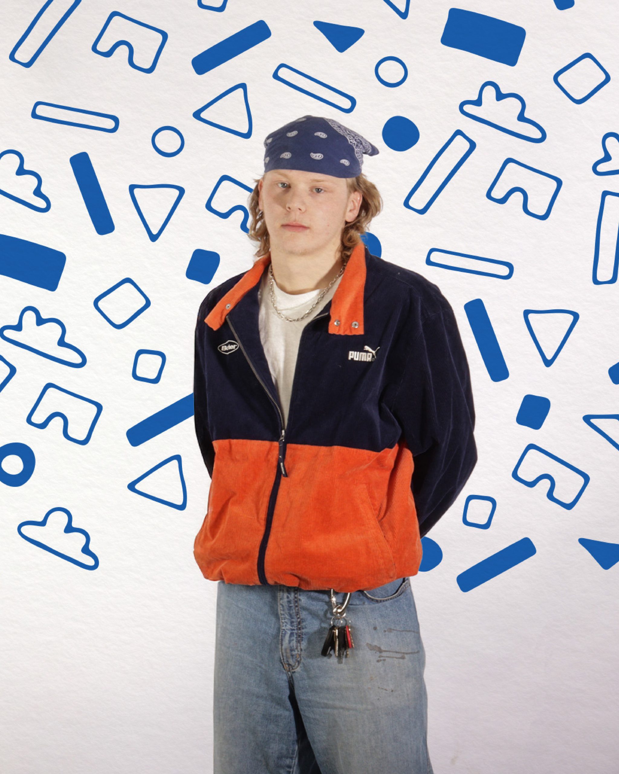
Fynnley Pearson

My journey in the Graphic Design program has been very up and down. Inside and outside of school, I felt I was always fighting something. Despite that, I pushed through, and I couldn't feel more proud. Not only for myself, but also my classmates. They have pushed me at every opportunity and made me a better designer. I hope that I had at least some of that impact on them too.

I am extremely grateful for what I have learned throughout my time here. I have gained and improved so many of my skills that I could never have even fathomed. Being able to gain these skills and opportunities has only strengthened my love and passion for design. I am eager to get into the workforce not only to show what I have learned but also to obtain even more skills that I'll be able to use in my work.

I am eager for Grad Show this year. I am quite excited to display my work and have a chance to get my foot in the door. I hope to see you there, and I hope I have the opportunity to meet with you.

LEE Magazine

  • Print Design
  • Editorial

In 2023, I lost my grandmother unexpectedly. She was my rock—the person who kept me grounded. It was a difficult time, but I knew she would have wanted me to keep going. At the time, I was in my second year of Graphic Design, working on a project to develop a magazine on any topic of our choosing. I decided to honor her in the best way I knew how: through design and food.

From this, LEE was born—a magazine and website dedicated to strengthening Winnipeg’s connection to food. Whether it’s a night out with friends or cooking ramen with a loved one at 12:30 AM, LEE celebrates the ways food brings people together.

For this project, I reached out to Hoagie Boys, a local sub shop in South Osborne, now with a second location at The Handsome Daughter. The experience was invaluable—it taught me not just the intricacies of editorial design, but also how to collaborate with professionals in a real-world setting. If you’d like to read the full article, you’ll find it at the end of this section.

Type Directors Club Poster

  • Typography
  • Print Design

This project explores the ever-growing divide between the ultra-wealthy and everyday people. As the wealth gap continues to expand, so does the frustration and sense of hopelessness felt by society—an exhaustion that this poster seeks to embody. The bold red background immediately sets the tone, evoking anger and urgency. At the center, perched upon a pedestal of words and names, sits the one percent, visually emphasizing their isolation from the rest of society.

A Type Supreme

  • Print Design
  • Editorial

In the first semester of Communication Design, we were tasked with researching and designing a print piece on a topic of our choice. I chose Supreme, a streetwear brand that has left an undeniable mark on fashion. Clothing has always been a passion of mine, and with this project, I wanted to go beyond aesthetics—I wanted to analyze what made Supreme, Supreme. I studied their successes, their missteps, and what lessons I could apply to building my own brand.

The design reflects Supreme’s identity: isolated, bold, and unapologetic. The brand is a trailblazer, a disruptor, the color that breaks up the white space—and that’s exactly how this piece was designed to be seen.

Friends & Family
Wednesday, May 7, 2025
12:00 PM8:00 PM
Manitou A Bi Bii Daziigae
Industry
Thursday, May 8, 2025
5:00 PM9:00 PM
Manitou A Bi Bii Daziigae
Land Acknowledgement

RRC Polytech campuses are located on the lands of the Anishinaabeg, Ininiwak, Anishininwak, Dakota Oyate, and Denésuline, and the National Homeland of the Red River Métis.

We recognize and honour Treaty 3 Territory Shoal Lake 40 First Nation, the source of Winnipeg’s clean drinking water. In addition, we acknowledge Treaty Territories which provide us with access to electricity we use in both our personal and professional lives.