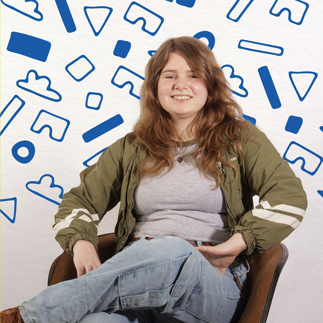
Maureen Henderson

Hey, I’m Maureen!
I’m known for my colourful style, love of surrealism, and endless fascination with all things nerdy—think Star Wars, D&D, Magic: The Gathering, and beyond. When I’m not designing, you’ll usually find me lost in an anime binge or dreaming up extravagant, experimental ideas for my next art project.

For me, graphic design is where creativity and problem-solving meet— a balance I’ve been exploring since childhood. Growing up in rural Manitoba with a passion for making things, I quickly learned that creativity often meant working with whatever I had on hand. Whether it was drawing murals on the walls with crayons (sorry, Mom!) or improvising materials to craft my own lightsaber, I was always making and adapting.
Sure, not every project turned out perfectly (or even worked), but each one taught me to think outside the box and tackle challenges head-on.

Today, that same adaptability and resourcefulness fuels everything I create—and I can’t wait to bring that into industry.

Inspector Gadget Intro

  • Animation
  • Typography

For this project, I was tasked with designing a wordmark for a show of my choice, which would later serve as the foundation for an animated intro. I chose Inspector Gadget, knowing  its original wordmark was dated and needed for a modern refresh. In reimagining the design, I drew inspiration from the aesthetics of spy films and the timeless appeal of classic novel covers. I selected the bold, sans-serif typeface Scandia for its strong visual presence—reminiscent of the confident, impactful typography often found in espionage media. The rounded form of the letter “G” provided a perfect opportunity to subtly incorporate bolts, nodding to the show’s gadget-centric theme.

For the colour palette, I wanted to preserve the nostalgic charm of the original series while introducing a bold contrast using red and blue to symbolize the ongoing battle between good and evil. To ground the composition, I added beige as a neutral balancing tone. During the animation process, I introduced orange to enhance versatility and bring additional depth to more dynamic and complex scenes.

See the full animation at my site maureendesign.ca

Friends & Family
Wednesday, May 7, 2025
12:00 PM8:00 PM
Manitou A Bi Bii Daziigae
Industry
Thursday, May 8, 2025
5:00 PM9:00 PM
Manitou A Bi Bii Daziigae
Land Acknowledgement

RRC Polytech campuses are located on the lands of the Anishinaabeg, Ininiwak, Anishininwak, Dakota Oyate, and Denésuline, and the National Homeland of the Red River Métis.

We recognize and honour Treaty 3 Territory Shoal Lake 40 First Nation, the source of Winnipeg’s clean drinking water. In addition, we acknowledge Treaty Territories which provide us with access to electricity we use in both our personal and professional lives.